
 There are numerous ETFs that track everything from countries, commodities, currencies and stock market indices to individual market sectors. ETFs provide a wonderfully easy way to discover what’s happening in the world markets. I apply a version of my System Quality Number® (SQN®) score to measure the relative performance of numerous markets in a world model.
The Market SQN score uses the daily percent change for input over a 100-day period. Typically, a Market SQN score over 1.47 is strongly bullish and a score below -0.7 is very weak. The following color codes help communicate the strengths and weaknesses of the ETFs in this report:
- Dark Green: ETFs with very strong Market SQN scores > 1.47
- Light Green: ETFs with strong Market SQN scores (0.70 to 1.47).
- Yellow: ETFs with slightly positive Market SQN scores (0 to 0.70). These are Neutral/Sideways
- Brown: ETFs with slightly negative Market SQN scores (0 to -0.7).
- Red: Very weak ETFs that earn negative Market SQN scores (< -0.7).
This is basically the same rating scale that we use for the Market SQN Score in the Market Update. The world market model spreadsheet report below contains a cross section of currently available ETFs; excluding inverse funds and leveraged funds. In short, it covers equity markets around the globe, major asset classes, equity market segments, industrial sectors, and major currencies.
World Market Summary — Equities & Currencies
Each month we look at the equities markets across the globe by segment, region, and sector.
The market had started to look much better, but now the table for the model looks rather neutral with a lot of yellow. There are some greens but just as many browns and red.
The US Dollar remains in a trading range where it has been since the 3rd quarter of last year. In addition, it has moved from green to yellow this month. There are only two green currencies in the model this month – the Indian Rupee and GBTC, our proxy for Bitcoin.
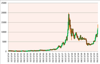
It’s easy to see what is happening in the chart of Bitcoin on the right. The weekly bars go from the beginning of 2014 to the present. Watch my mid-month crypto update for more information.
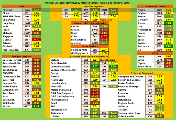
On the US equities front, the large caps (top row) are green, whereas all the other major categories of US Equities are yellow except for mid-cap growth (IJK).
In the Americas, Canada and Argentina are bullish. Everything else is bearish, with Chile being strong bear.
In Asia, we have Australia (not really Asia but I put it there), Singapore and India green. Malaysia is brown while South Korea is red. Everything else is yellow.
In Europe, Switzerland (with a weak Swiss Franc) and Greece are strong bull. Slightly bullish countries include France, Italy, the Netherlands, and Russia. Poland is bearish and everything else is yellow.
In Africa, Nigeria, Egypt, and South Africa are brown. Africa as a whole is yellow.
If we look at the US sectors, we have only Consumer Staples being strong bull. Basic Materials, Consumer Discretionary, Financial, Homebuilders, Food and Beverage, and Insurance are all slightly bullish. Oil and Gas Equipment is strongly bearish, while Metals and Mining, Oil and Gas Exploration, and Gaming are all brown. Everything else is neutral.
Commodities, Real Estate, Debt, and the Top and Bottom Lists
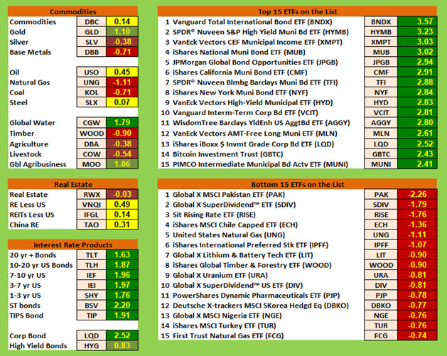
Commodities are mixed with a slightly bearish tendency. Global Water is strong bull. Gold and Global Agribusiness are bullish. Commodities, Oil, and Steel are all neutral. Base Metals, Natural Gas, Coal and Timber are all very weak. Agriculture and Livestock are both weak.
Because interest rates are not going up any more, the interest sector is all dark green with no exceptions except for High Yield which is still light green.
Nearly all of the real estate symbols are yellow.
What’s really interesting is that the 15 strongest ETFs are all dark green like last month. Last month the lowest ranking of the top 15 was 3.71 and this month you need 2.41 to make the top 15. Everything in the top 15 has to do with interest rates except for #14 which is the Grayscale Bitcoin Trust (GBTC).
This ranking is a good exercise to show that the Market SQN score has a lot to do with steady climb and low volatility. I’d expect that’s the case with all of these interest rate ETFs. In contrast, GBTC (think Bitcoin) has nearly tripled in about two months (no ETF in the top 15 did that) but because of its more volatile nature, it has a Market SQN of 2.43. On Mar 31st, BTC closed at $4,130 and on June 30th, it closed at $11,171.
On the bottom list, all 15 are red and the worst is Pakistan at minus 2.26. It is the only ETF worse than minus 2.0. And only the worst five are lower than minus 1.0. The bottom 15 are interesting as the list includes Chile, Natural Gas, Lithium, Timber, Pharmaceuticals, Uranium, and South Korea.
Summary
Let’s look at the summary table which measures the percentage of ETFs in each of the strength categories. You can see the distribution of the database by Market SQN score in bullish, neutral and bearish categories below —
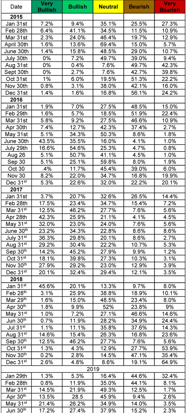
The percentage of ETFs in each category confirms what I said about the market becoming more neutral.
Be careful to base your actions upon what IS happening, not what you think might happen. The markets always offer opportunities, but to capture those opportunities, you MUST know what you are doing. If you want to trade these markets, you need to approach them as a trader, not a long-term investor. We’d like to help you learn how to trade professionally because trying to navigate the markets without an education is hazardous to your wealth. All the beliefs given in this update are my own. Though I find them useful, you may not. You can only trade your own beliefs about the markets.